Case study
Pattern consolidation: delivering consistency across an editorial platform
Overview
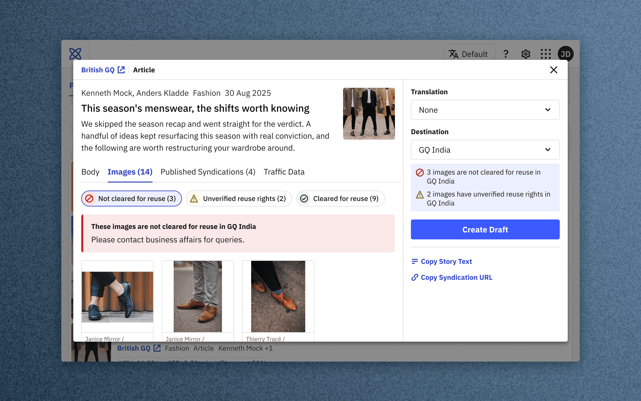
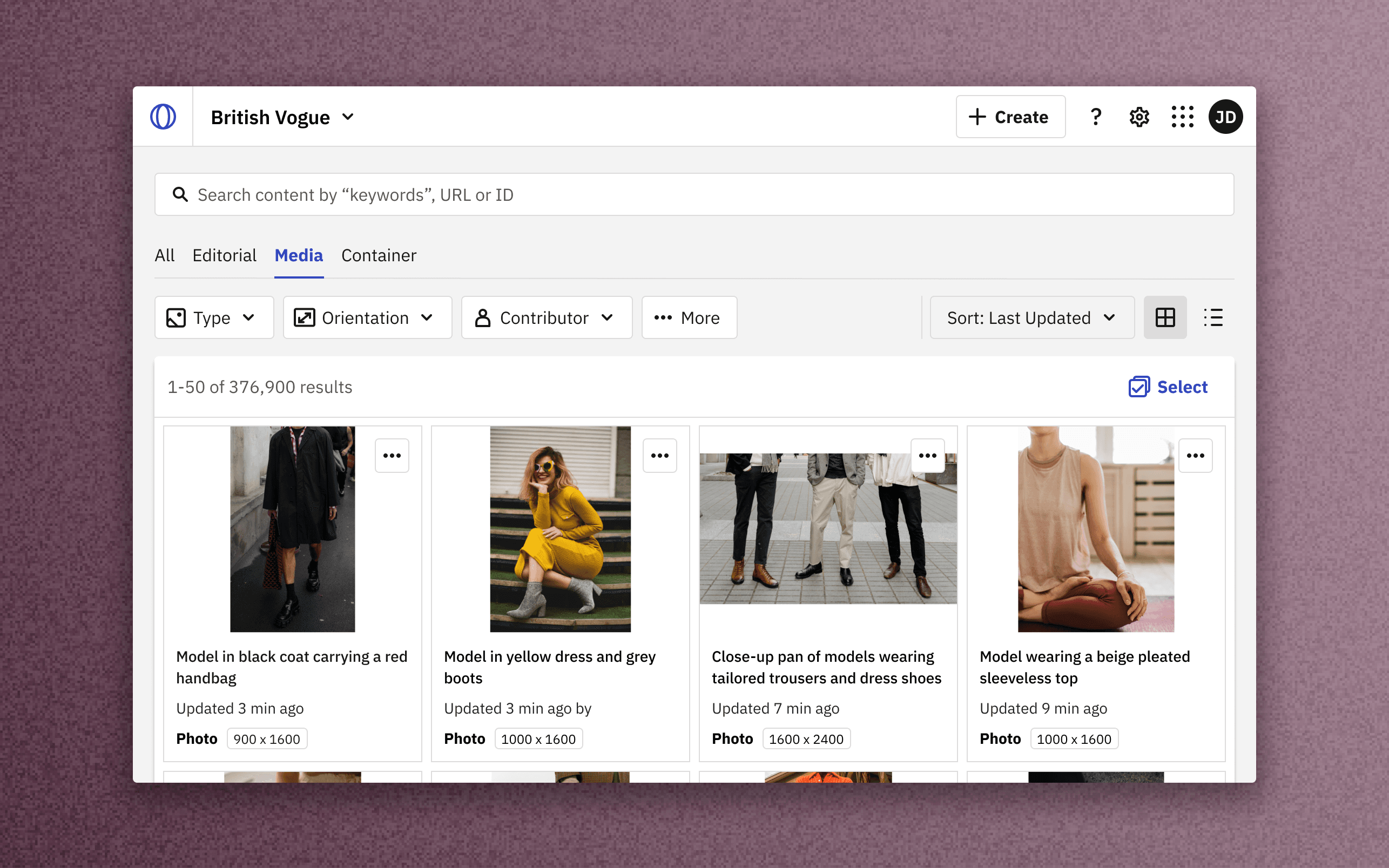
Condé Nast is unifying its editor-facing applications into a coherent suite to supercharge day-to-day operations at media brands like Vogue, GQ, The New Yorker and WIRED.
The platform design team supported this effort by promoting a centralized design system, reusable patterns, and consistent naming conventions, thereby improving editorial experience while also increasing development velocity.
Within this initiative, I drove improvements across five key areas:
Content cards
Most components are general-purpose, built to fit any tool. Content cards are a deliberate exception. Their fields, hierarchy, and density shift to match the context and job at hand.
- In syndication workflows, adaptation editors select from a cross-brand, cross-market compilation of published stories, with editorial fit and performance potential in mind, so the list item surfaces credited author and performance analytics.
- In the CMS, digital editors work within a single regional edition’s environment, so metadata is tuned for operational work, surfacing collaborators and publishing status.
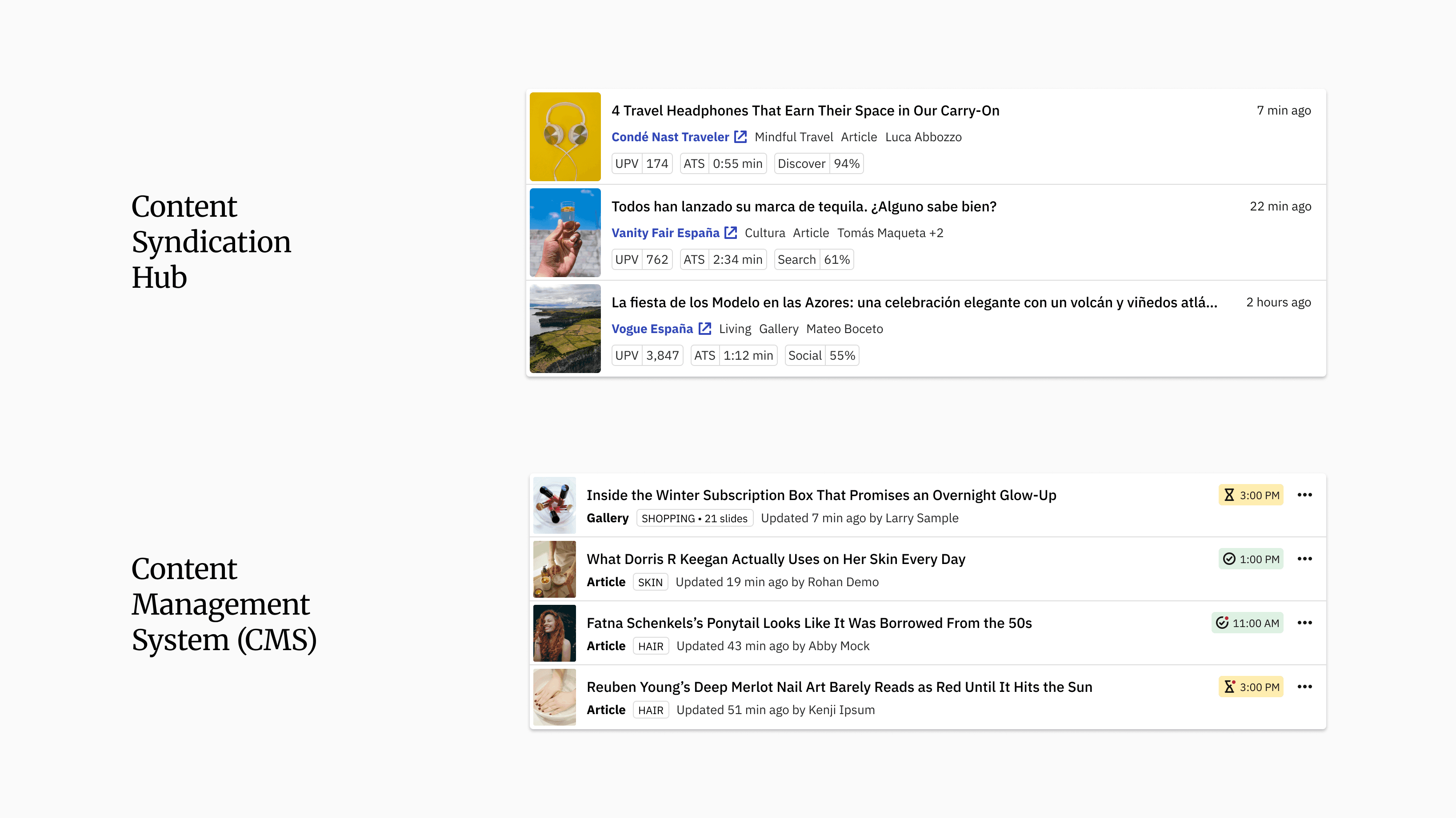
Content status and metadata (CMS)
- Status indication carries both color and an icon, no legend needed.
- Expanded to show publish date (or time) alongside status.
- A badge strong enough to work within content cards and as an inline badge on content pages.
Iconography realignment
Content type icons were gradually phased out. Why?
- As the volume of content types grew their icons became harder to tell apart. Obscure icons created icon fatigue instead of aiding scannability. Easily scannable bold labels + unique metadata pill made the content type icons redundant on content cards.
- Icons were instead redirected to chrome, actions, filters and status indication, where they represent universal, repetitive system behaviors.
Segmented controls
- Tab and button-groups reworked to support vertical and horizontal layouts.
- The active tab's label and underline now share one accent color, so the selection reads at a glance. This replaced the legacy black colored active label, aligning the component with current design conventions.
- Button groups added as a compact alternative for inline contexts.
Disclaimer: Product screens show placeholder articles, images, names and credits. Internal references are obfuscated.