Case study
Enhancing content and asset discovery within a global media company’s CMS
Summary
Condé Nast's CMS made it hard for editors to browse content, make sense of search results, and review and share selections. We revised search experiences across two key touchpoints so editors could find and work with content reliably.
Impact
CSAT up 11 % points within 12 months. Search and index pattern standardized and reused across other tools.
Scope
- Research co-facilitation
- UX and UI design
- Usability testing
- Refinement
Background
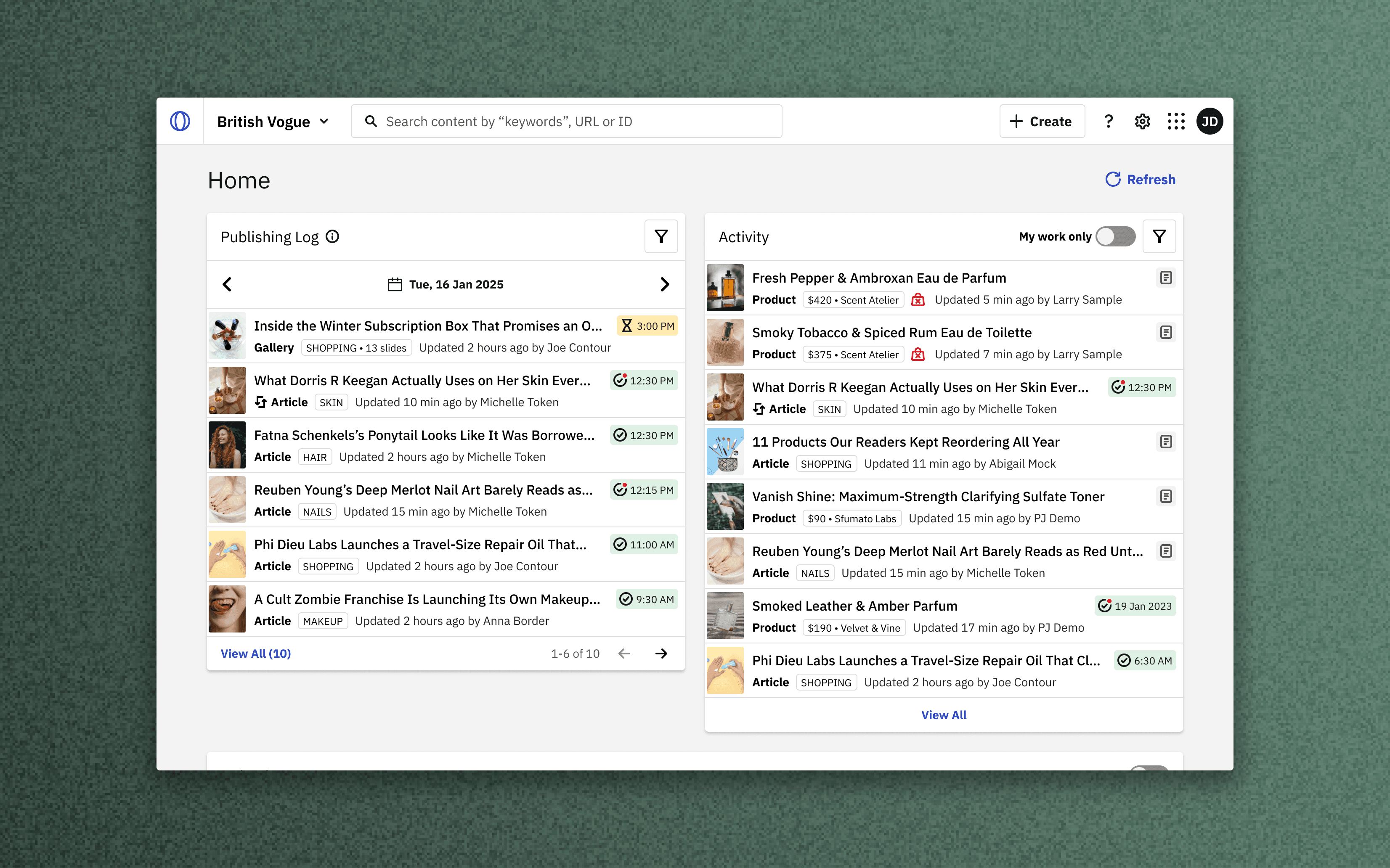
Condé Nast's multi-tenant CMS serves as the backbone of editorial operations at global media brands like Vogue, GQ, and Vanity Fair. There are two primary touchpoints that feature search experiences.
- CMS search — index of all editable content within the CMS
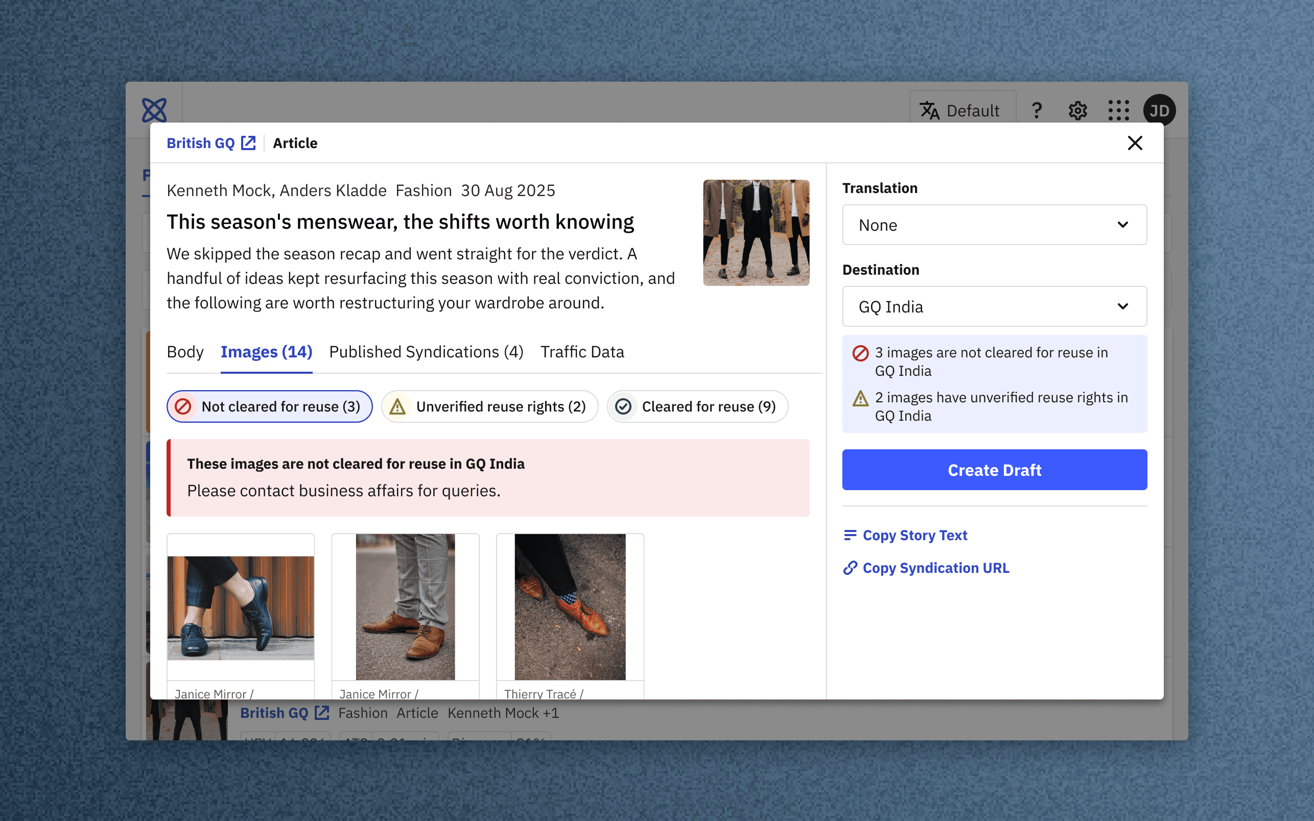
- Asset selector — contextual tool for placing assets into stories
Research goals and approach
We leveraged Condé Nast’s CMS migration from Ember to React to improve how users find, edit and place content. We ran moderated interviews with editors across 5 regional editions to:
- Map how editors navigate the CMS and adjacent tools. Evaluate when, where and how they search for content.
- Capture search, refinement and filtering habits. Rate ease of search, satisfaction, and expectations.
- Identify ways to improve performance, relevance, and UX.
Problems with legacy search
Didn’t represent different roles and ways of working
- Different editorial roles work with different content, but the experience didn’t reflect this.
- Users reliably retrieved known-items, but found open-ended browsing limited.
Forced order and hidden tools leave users in the dark
- Many didn’t realize that results were ordered by recently modified, by default with no way to sort. Relevant results were often further down the list.
- Some weren't aware they could search by ID, URL, or quote-marks.
Editors found it difficult to review and share lists
- There was no way to set selections aside for review, or pass them on to subsequent workflows.
- The legacy bulk-actions were seen as limited.
Asset selector locked users to a single asset
- Asset search was locked to a single asset type at a time, with no way to search across an entire database.
- No categorization, filtering or sorting at all.
How might we...
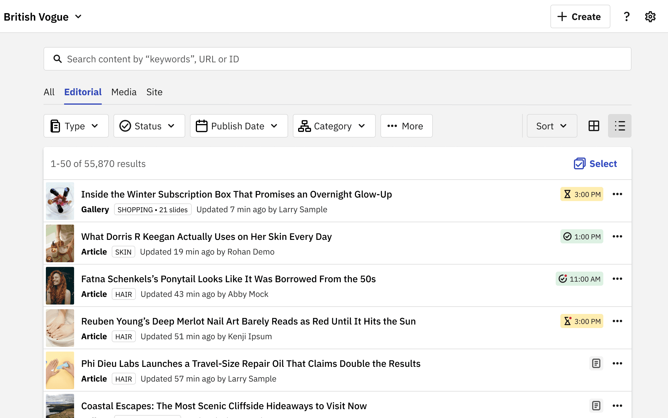
Communicate search and filter capabilities at a glance
- Thinner card-less layout with filters, sorting, selection and results laid out cleanly.
- Revised search bar micro-copy. Icons added to filters to aid scannability. Contributor and Collaborator now sit with the other filters.
Adapt the experience to different editorial jobs
- Filters and layout adapt to new tabs: the essentials stay visible, the rest sit one click away in More. Eg. for “Media” layout defaults to grid, and filters tied to publishable entities are swapped.
- Custom publish date range introduced in addition to presets.
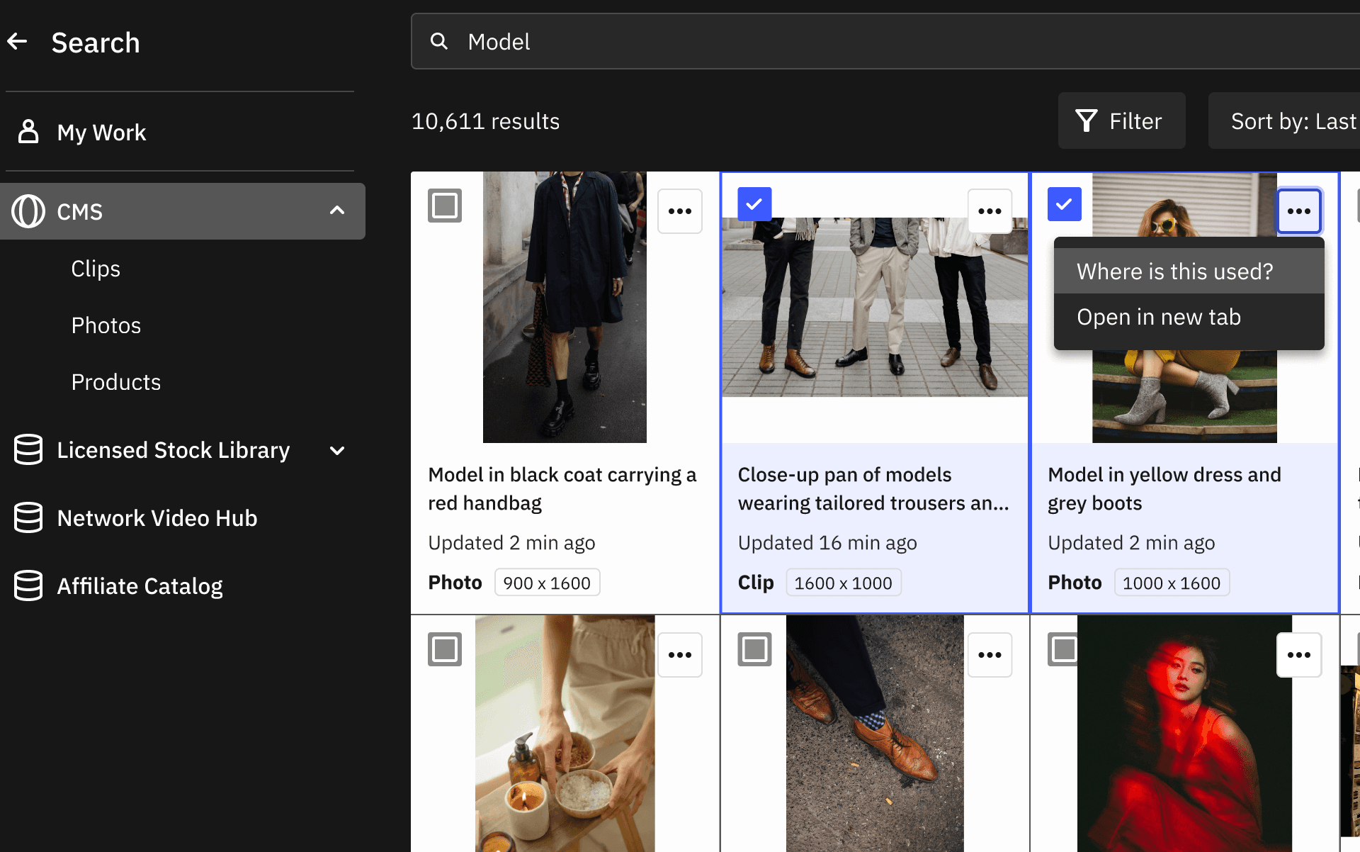
- Asset selector organizes internal, centralized and licensed assets by database (detailed in final section).
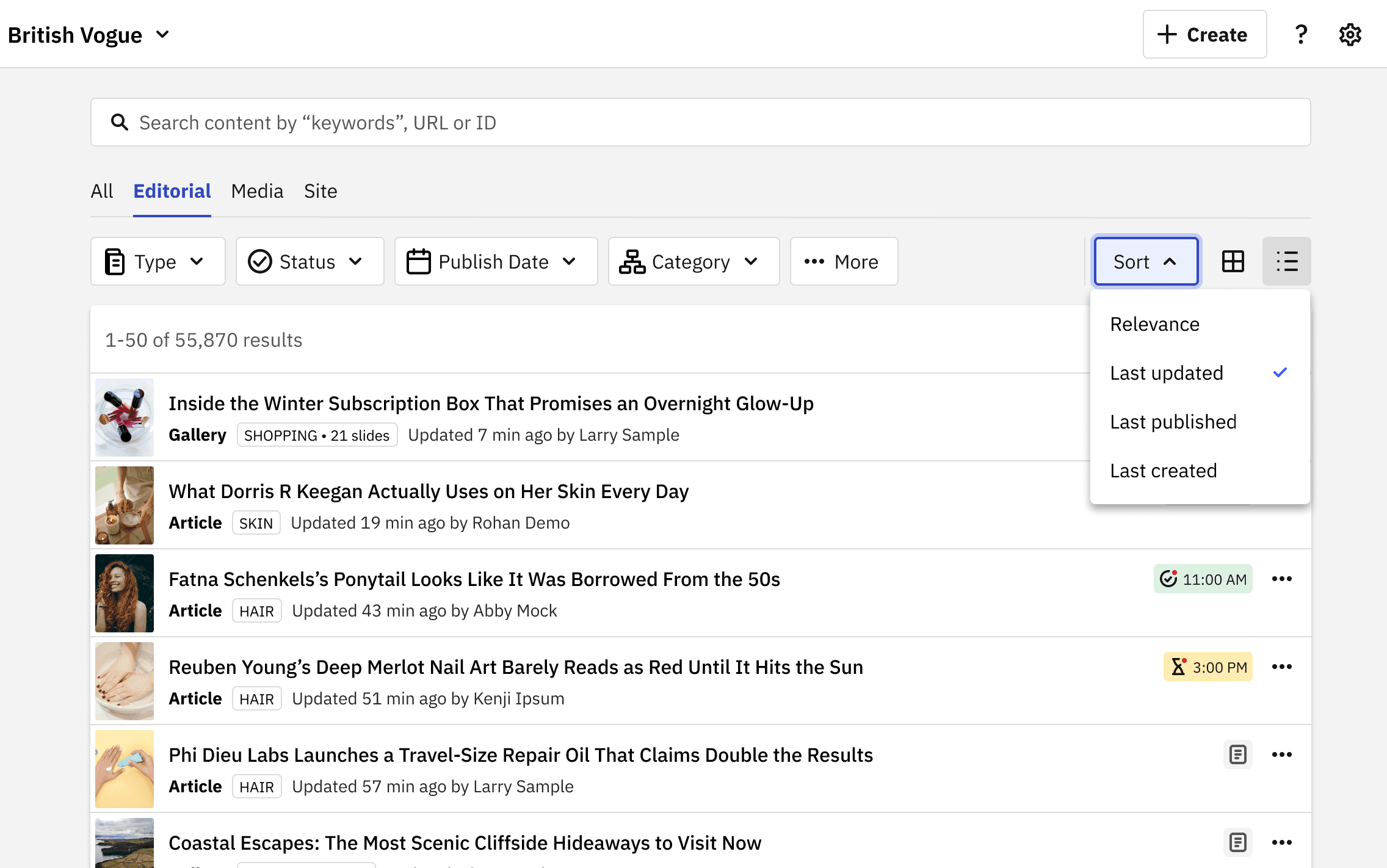
Ensure results are more discoverable, relevant and controllable
- Sort dropdown with: Relevance, Last updated, Last published, Last created.
- Re-tuned weights to prioritize exact title match > partial title match > body match. Read more embeds excluded completely.
- Revised list items that lead with thumbnails instead of checkboxes.
Help editors gather, review and hand off selections
- Revised batch actions pattern with floating action bar.
- Takeover modal that isolates selections for review, retaining familiar list item treatment over dark chrome.
- Export CSV allows users to share lists outside the tool.
Help editors confidently find, vet and place assets in stories
- Assets grouped by source library (anonymized) instead of a flat list, with filters + sort derived from the library’s unique parameters.
- "My work" shortcut, useful for multi-media and commerce editors.
- "Where is this used?" lets editors check prior placements. “Open in new tab” allows them to further inspect without closing the view.
Usability-testing outline
Moderated task-based prototype-tests with power users across 5 regional editions to evaluate the design overhaul. Line of inquiry:
- Do users understand the categorization of content and assets across the two touchpoints?
- Do users understand search capabilities, filters and sorting, and how to use them to browse content and find assets?
- Are users aware of the actions they can perform on content and assets from the two touchpoints?
Feedback and fixes
✅ Participants understood and appreciated the revised layouts, filters, content actions, batch-action pattern, and list item design.
✅ Participants accurately described what they would find under “All”, “Editorial” and “Media”, groups on the CMS index.
✅ Revised asset selection experience — shortcuts, search by database, filters — was seen as a lot more powerful and faster.
⚠️ “Site” poorly described packaged items (homepages, topic pages, PLPs) that surface across both the website and mobile applications.
Fix: "Site" was renamed "Container" to better describe the schema of items in that bucket, rather than the channels they featured across.
⚠️ Sort order was not obvious enough. Users still guessed the order from the list items rather than checking the selection from the sort dropdown.
Fix: Dropdown was adjusted to explicitly display the selection, so that the active sort is visible at a glance rather than inferred from results.
Shipped CMS index
Shipped asset selector
Outcomes
- CMS satisfaction up 11 percentage points within 12 months.
- Standardized index page patterns, carried into other editor tools.
- Improved categorization, filtering, sorting, and search, helping editors find the right items sooner.
Disclaimer: Product screens show placeholder articles, images, names and credits. Internal references are obfuscated.