Case study
Shipping a CMS Home shaped by the editorial routines of a global media company
Summary
Condé Nast's CMS Home had poor information architecture, weak information presentation, and failed to serve the full range of editorial roles. We established a foundation with opinionated job-oriented modules, and richer list items.
Impact
CSAT up 11 % points within 12 months. Dwell time up by 100%.
Scope
- Research synthesis
- UX and UI design
- Concept testing
- Concept refinement
Background
Condé Nast's proprietary multi-tenant CMS powers content creation, management and publishing, serving as the backbone of editorial operations at brands like Vogue, GQ, The New Yorker, and more. The CMS Home (formerly called the “Dashboard”) is the default landing page and a common entry point to working copies of editorial content.
Problems with the legacy experience
Stakeholder feedback and heat-maps pointed toward three problems.
Unclear information architecture
"My Content" vs "All Content" tabs were widely misunderstood leaving users unsure where to look. Users bypassed the homepage entirely, relying on direct bookmarks and saved search parameters.
Modules had low role-relevance
While moderately reliable for diving back into personal files, reviewer and strategy roles lacked a breakdown of outgoing content and work-in-progress. Flat lists of “recent” content were seen as insufficient.
Weak information presentation
The legacy publishing status legend was completely unclear. Content list items lacked key metadata, and the absence of key identifiers hurt scannability and discoverability.
Concept Generation
Four editorial jobs-to-be-done shaped the ideation effort
- Everyone:
“I want to understand the status of a content at a glance” - Creator-Producers (multi-media editors, writers, digital editors):
“I want to quickly drop back into my recent work” - Producer-Reviewers (section leads, copy chiefs):
“I want to see ongoing work across the brand so I can collaborate” - Reviewers-Strategists (editorial leads, executive editors):
“I want to monitor outgoing content across the brand”
Two concepts were developed sharing a common foundation
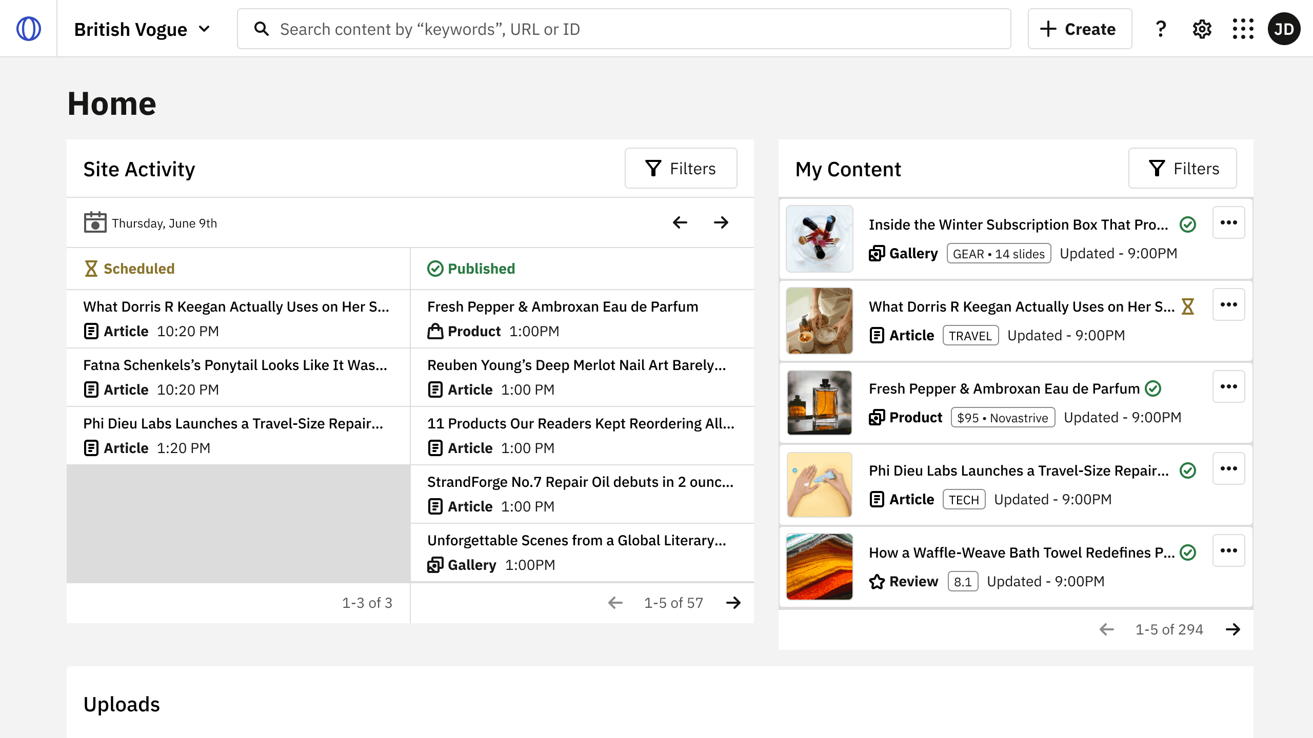
A single-view layout replaced the tabbed view with fewer opinionated modules: a single My Content module; a prominent media uploads module; a resources footer component and revised publishing status indication.
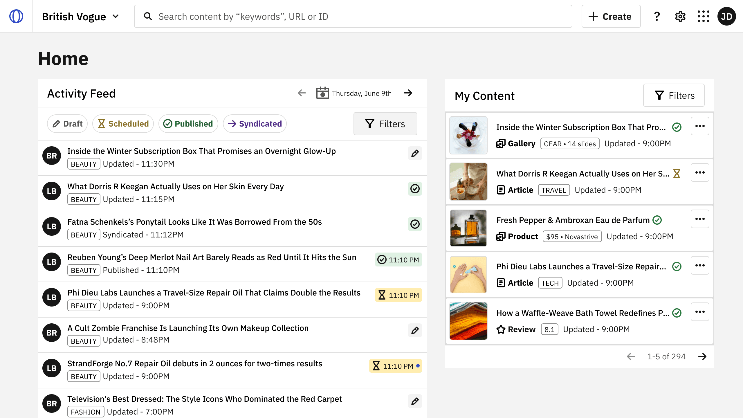
The two diverged in how they handled the opening module
Comparison testing
Moderated task-based user sessions with editorial stakeholders from 5 regional editions were conducted to evaluate how well the two concepts addressed the problems identified. Each session probed:
- comprehension & discoverability;
- adequacy of content metadata;
- task continuity;
- and clarity of affordances.
Concept A - Preferred🥇
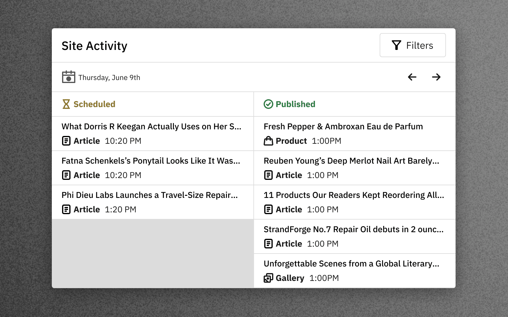
- Well received for giving visibility into published and scheduled content through time.
- The split view for published and scheduled was seen as unnecessary.
Concept B - Close contender
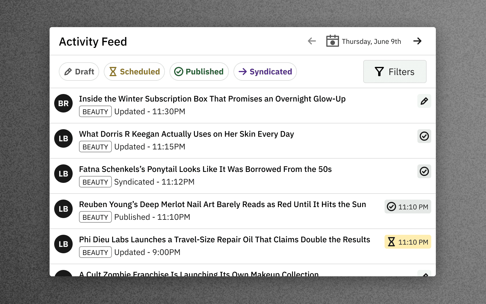
- While appreciated by users who accurately understood the module, this iteration was seen as trying to do too much.
- Promoted chips didn’t test well as quick filters. It wasn’t clear whether the leading initials represented collaborators or contributors.
Feedback on the rest of the homepage concept
- Participants appreciated list items with thumbnails, and expanded metadata, but wanted it across all modules.
- Clear publishing status indication was widely appreciated.
- Users appreciated filters that mirror the search page experience (particularly category and people) is seen as particularly useful.
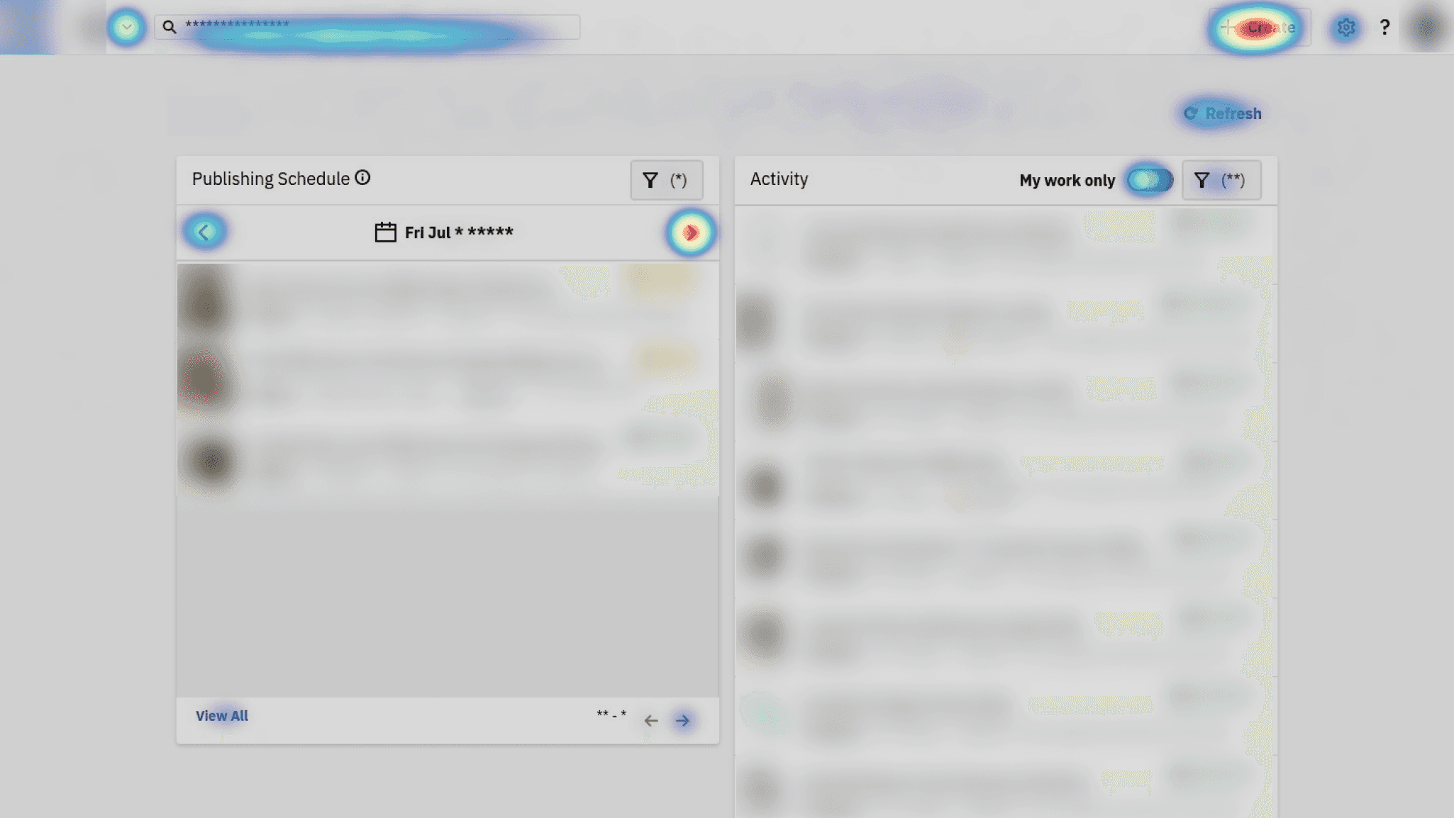
- The need for a noticeable page refresh control was observed.
Concept refinement
- The Concept A was preferred as the opening module for its opinionated approach. It was renamed “Publishing Schedule” to better describe its function, with “Content Calendar” having a different meaning in planning workflows.
- The split view between published and scheduled was swapped for a single list where scheduled naturally stacks beneath published content for current and upcoming days.
- “My Content” was replaced with “Activity” complemented by an exposed “My work only” toggle, thereby satisfying two use-cases.
- A unified content card across the entire application.
Shipped CMS Home
Revised status indication and content list items
Outcomes
- User activity surged on new home modules with reduced reliance on offline workarounds.
- Homepage saw reduced exits and dwell time up 100%
- CMS satisfaction increased 11 percentage points within 12 months
Looking ahead
- With a baseline default layout established, future iterations would explore customizable home layouts and modular selection.
- Inclusion of a module that summarizes performance data to bridge users over to the content analytics hub.
Disclaimer: Product screens show placeholder articles, images, names and credits. Internal references are obfuscated.